August 11, 2018
Create a London Underground map for your wedding seating chart
Work in progress demo here
You may have seen many tube/subway themed seating charts before. They show your guests where they should sit by using London Underground lines as tables. Each guest is a ‘station’ along the line. If you have 5 tables then you’ll need 5 lines (such as the Bakerloo, Northern or Central lines) on your seating plan. It’s ideal if you are having a wedding in London, are Londoners or simply love Transport For London.
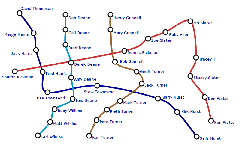
I wanted to see if this could be automated - just enter your lists of guests and let the code do the rest…Some challenges quickly emerged however:
- How do I lay out the lines? A typical map has lines criss crossing over each other. Would it be hard to read?
- TFL maps have little rectangles or ticks to denote each station and white circles denote an intersection with another station. How will I rotate the rectangle correctly if the line curves over the screen
- In a real map station labels are either above or below the line to improve readability. How will I detect how best to position my guests’ names?
As you’ll see from the demo at the top of this page, some of these challenges are yet to be overcome. I’ve used a drag function to let the user drag their guests/stations into a new position as they see fit. By default each line/table is showed as a vertical line (see below) but users can create their own layouts easily by dragging names around.
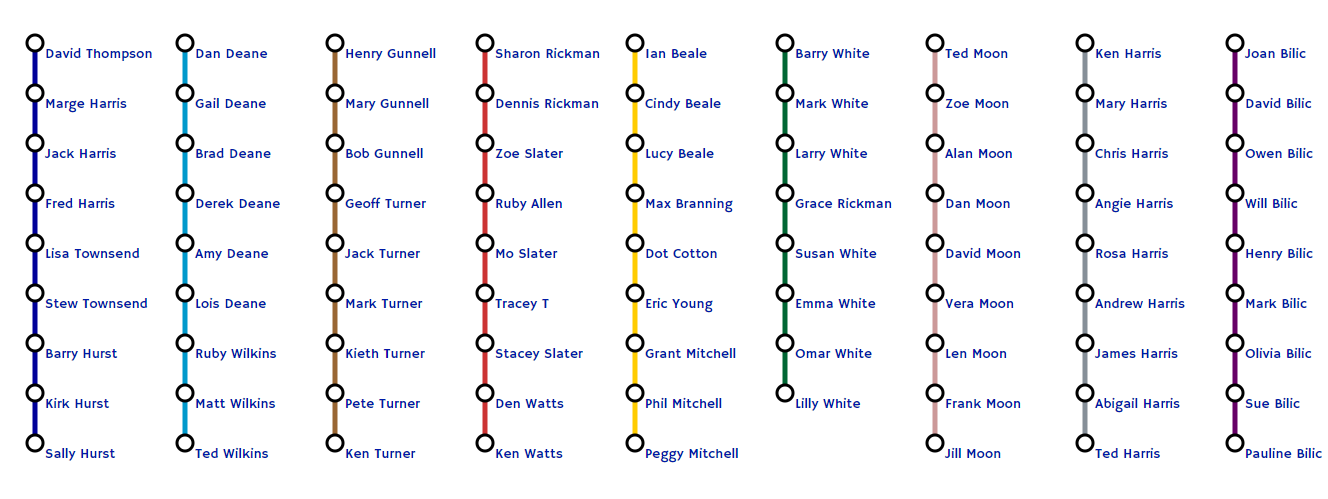
I then rather cheekily use a second drag function on the text elements (the guest names) themselves. This means they can be further positioned if needed (but this setting is reset if you move the parent group again)
I’ve also used a circle for every station, rather than little ticks. I open to suggestions on how I could automate the rotation of the rect given that I’m letting the user drag stations around at whim.
A legend is probably needed (not everyone will know that the Victoria line is blue). I finished by using the free google font ‘Hammersmith One’ which seems to resemble the font used by TFL.
I built the prototype using blockbuilder and the rendering of the svg is handled by d3.js. This block demonstrates different line generators to see what curve looks best. I went for d3.curveCatmullRom.alpha(0) in the end. This block here does a great job of rendering a tube map but I haven’t yet taken the time to dissect the code to see how to make it editable to a web viewer.
I plan to integrate this into the online seating chart tool I’ve made so users can edit the guests easily and then save to pdf